Web design that turns visitors into enquiries
Every client brief we get asks for something that ‘stands out’. Fair. But standing out is the easy part: confetti stands out. The harder job is making a visitor understand, in under five seconds, what you do and why they should care.
Clarity is a design decision
We start every project by writing the headline before we open a design tool. If we can’t say it in one sentence, no gradient will save it. Layout, type and motion come after, and they exist to serve that sentence.
That sentence needs to describe an offer someone can recognise. A local installer and a software team have different customers, questions and reasons to be trusted. A vague promise about quality tells neither visitor enough to decide whether they are in the right place.
We ask what the visitor already knows and what they need explained. Someone arriving from a recommendation may be looking for a phone number. Someone comparing suppliers may need to understand the process, see relevant work and check whether the service covers their situation.
A clear page gives those needs an order. The opening explains the offer, the following sections provide evidence and the final action helps the visitor continue. Design brings that sequence together rather than asking people to work it out for themselves.
What calm looks like in practice
Calm does not mean empty. A page can include detailed information and still feel easy to follow when related ideas stay together. We use clear headings, comfortable text widths and a consistent rhythm so a visitor can skim first and read more closely when something matters.
We also give each visual a purpose. A project image can show the quality of the work. A diagram can explain a process. An animation can make a change easier to understand. When an element does none of those things, we question whether it needs to be there.
- One primary action per screen, never three.
- Type that does the heavy lifting, so imagery can breathe.
- Motion that explains, rather than performs.
- Load times under two seconds, because patience is not a strategy.
The goal is a website that explains the offer and makes the next step clear. Whether it improves enquiries needs to be checked against the project's goals and available data.
Make the next step feel obvious
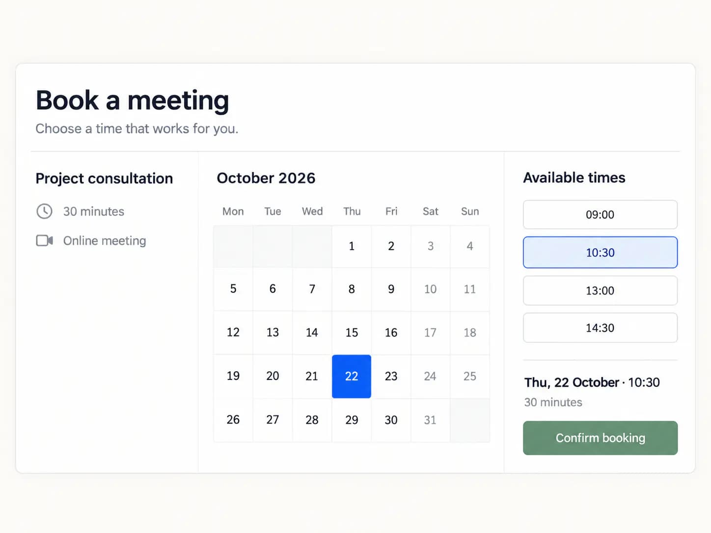
A visitor should understand what happens after pressing a button. ‘Get a quote’ suggests a different next step from ‘Book a call’. We choose the wording to match the actual process and explain any useful details nearby, including what information the team needs to get started.
For example, a service page might finish with a short enquiry form and an explanation of who will reply. Asking for a name, a way to respond and a description of the task may be enough for an initial conversation. Further details can come when they become relevant.
The same care belongs inside the form. Labels should stay visible, errors should explain how to continue and the confirmation should tell the visitor what happened. The page has only done its job when the next step feels as clear as the offer that led to it.
Show the evidence behind the promise
A claim about expertise becomes more useful when someone can see what it means. We connect services to relevant projects, describe the problem the work addressed and explain the decisions that shaped the result. A few specific details can say more than a long list of adjectives.
The evidence should answer the question a visitor is likely to have at that point. A person choosing an installer may want to see similar projects. A team commissioning a digital tool may want to understand how the working process will fit around its existing systems.
We keep those examples close to the offer they support. People should not need to leave the page and search through the entire website to find a reason to trust what they have just read.
Keep the clarity after launch
A clear website can become confusing as new content arrives. Another service gets added to the menu, a temporary message stays in place and an old project no longer represents the business. We review these changes against the original purpose of each page.
Useful feedback often comes from everyday conversations. If the team repeatedly explains the same detail after an enquiry, that detail may belong on the website. If visitors ask for a service the business does not provide, the wording may need to be more precise.
The goal is a website that keeps helping people understand the business as it develops. A regular edit of the important pages protects that clarity and gives new work a place in a structure people can still follow.